I’ve been thinking and studying networked learning since last December, when I stumbled into the world of educator personal learning networks, spread across the world. From my first blind stumbles across the edges of various twitter PLNs, to discussions and thinking with Kelly Tenkely about the Learning Genome, to witnessing connected learning courses with MOOCs like Stephen Downes and George Siemens’ CCK11, to building my own PLN and contributing in collaborative efforts like the Reform Symposium.
(Note: there are lots of links referencing deeper material in these posts. All of them will open an external window to avoid continually hitting the Back button in the browser. Apologies if you find this annoying.)
At the back of my mind are some primary concerns as we create learning environments from Being Prudence:
- what does the topology of a network of learning look like?
- are there benefits to network learning over individual learning experiences, and why?
- how do we (can we?) explicitly architect these networks with the best chance of propagating learning for children & youth?
- do these networks exhibit characteristics of complex adaptive systems? Affinity spaces? Can we implicitly design for serendipity and discoverability to engender forms of salience, bridging principles from interaction design? How do we privilege agency within such networks?
- what theories or evidence can we observe that create this situation? Where are we trending? Where do we want to head? Why?
This will be a series of ongoing posts, detailing my research and thinking in cross-disciplinary fields and how I’ve been synthesizing my ideas. I’d be very grateful to my PLN to contribute with comments, showing me your own views and challenges to holes in my thinking, to build a better overall collaborative understanding.
Part 1: What does the topology of a network of learning look like?
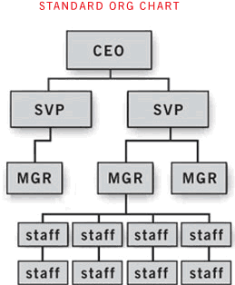
If we were to map a network of learning among multiple participants, what would it look like? I sincerely doubt it would look like this:
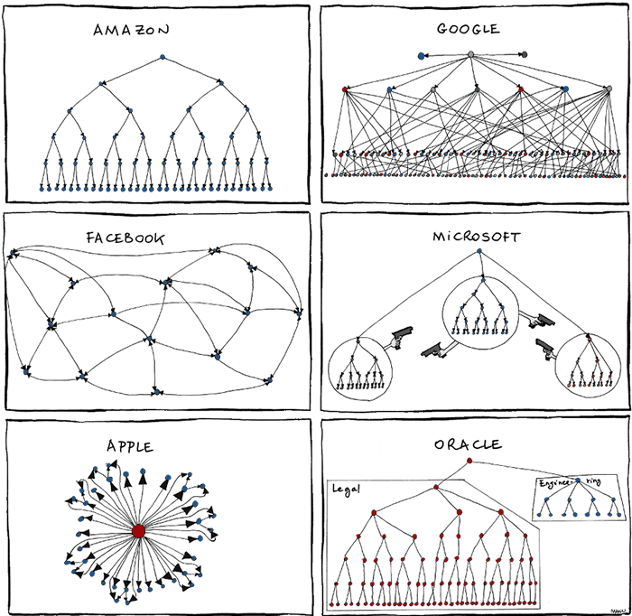
Recently a satirical view of org charts of various prized 21st century organizations popped up via John Gruber’s Daringfireball blog. Original source.
These simplified charts reflect how we perceive different types of groups “learn” from their leadership down.
These organizations are prized within the western world because they embody “innovation” and “success” on a massive, commercial scale. As of August 2011, Apple is flipping between being the first and second most valuable company in the USA. Although they’re all tech companies with different focuses ranging from social networking to consumer goods, one could argue that each of these groups has a core business principle of establishing network platforms – that is, the infrastructure or ecosystem that drive and attract more people towards the hyper-connectivity we live in at 2011. Although Apple can be viewed as a hardware/software or retail business, depending on your lens, it’s also accurate to view their entire business as an integrated ecosystem tying in consumers and 100,000+ 3rd party “publishers” with their products. Apple’s integrated network of iTunes, iPhones, iPads and ongoing products is fundamental to the success of their business. As a privately owned website that launched in 2004, active users of Facebook increased from a million in 2004 to over 750 million in 2011. Google’s YouTube launched in 2005 and is currently the 3rd most popular website according to Alexa and the busiest global broadcaster of video content with over 3 billions views per day, the majority of its content crowdsourced by volunteer participation.
Clearly, something dramatic has been occurring within the last 10 years, driving societies and markets globally to tipping points and major disruptions of traditional 20th century industries and models of citizenship.
Let’s return to examining the org charts. It’s interesting that half of them don’t resemble a traditional approach to org charts, and even in drawn in jest – there are nuggets of truth in how accurately they resemble reality within these organizations.
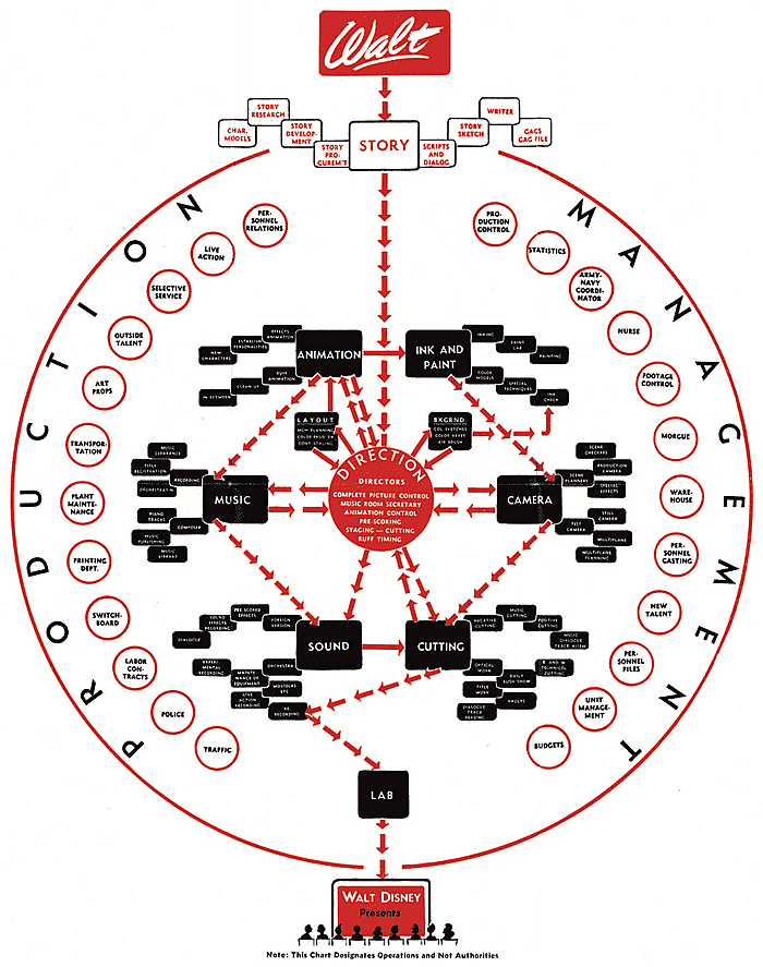
Here’s another chart of a highly successful 20th century business famed for creativity and innovation. Walt Disney Studios released their own org chart in 1943, outlining their then model of process and production. Source
This is a company that demonstrated an ability to create new products and technology (the films, the theme parks, their retail products integrating their multiple franchises) that never existed before. They learnt by making, iterating successively, building upon that learning as they went. Again, their mapping of their learning/making network is very different to a traditional org chart.
Org charts are idealised representations of groups. What does real learning within a network look like?
Fortunately, we now have the technology and research to analyse real world connections, whether virtual or face-to-face. Organizations like Google, Facebook and Twitter spend much of their resources focusing on realtime analytics of the “social graph”. Strikingly, the same technologies are also being used on real-life (non-virtual) social relationships and social networks. Nicholas Christakis performed a longitudinal study mapping the spread of obesity in a large social network over 32 years. Using computation techniques and a range of cross-disciplines, his continuing papers argue that nodes (the influential people within the network) can affect and propagate obesity through a face-to-face social network, and also other health states including smoking, drinking and happiness. Here is an excerpt from his TED presentation on the “Hidden Influence of Social Networks” where the topology of an observed social network within a real-world distributed community is mapped, building upon data recorded from his 32 year study.
The dots represent people. The lines connecting the dots represent relationships between each person. As the connectedness and social influence of obesity (or ‘the learning to be obese’) grows, the yellow nodes correspondingly increase in visual size. Note that this network of learning/influence doesn’t resemble a traditional org chart relationship at all? Instead, it bears very strong parallels to rhizomatic learning, as described by Mary Ann Reilly and Dave Cormier.
This animated “social graph” demonstrates real learning of human behavior spreading by the network. The behavior is real. The effects are real. Yet the majority of the study occurred before the last decade, and the focus of the study was on participants who interacted in a face to face relationship. How would the networked technologies of the last 10 years, in a hyper-connected world alter learning in this next decade?
Part 2 will focus on ideas related to theories related to connectivism, participatory culture, and ongoing trends in mass culture technologies including video games and other forms of digital media.
I look forward to discussing with you about the ideas above. Thank you.


